Product strategy | Design direction | UX/UI design | UX Research
Three audiences. One feed.
Built to fight digital isolation with proximity, one community at a time.
hOp saw something early. They noticed that social media was connecting us to people across the world while leaving us strangers to the person next door. Their mission was to build community where it's safe and simple to help Other people, that's where the name comes from.
I joined as a Senior Product Designer and left two years later as Head of Design, owning design across a three-sided ecosystem made up of residents, property managers, and the local businesses around each property.
The Problem
A tenant problem, not a pricing problem
Apartments turn over 64% of residents every year, costing owners about $4k per unit each time. The instinct is to blame price or square footage. The research pointed somewhere else. For seven years running, the number one reason residents renew isn't amenities, it's a sense of community. Only 11% of residents know more than 6 of their neighbors, but when they do, lease renewal jumps 70% (National Apartment Association, 2017).
Yearly turnover
64%
Know 6+ neighbors
11%
Renewal lift
+70%
You can't force people to make friends. What you can design is the conditions that make it easier. That's what hOp hired me to figure out.
The Impact
What shipped at scale
A unified design system meant the marketing team could build their own materials without coming back to me for every asset, and it's what let the product scale to 50 properties without looking stitched together by five different designers.
Properties deployed
50
Design inconsistency cut, across 5 platforms
80%
Local business partnerships
30+
The Challenge
Three customers, one product
hOp is a B2B2C product with three very different audiences, and getting the design right for all three, without losing clarity for any one of them, was at the heart of everything we built.
Property Manager
The paying customer. Needed a manageable resident roster, mass notifications, and events with RSVP.
Resident
The primary end user. Needed an actual reason to open the app after day one.
Local Business
The paying customer. Needed a manageable resident roster, mass notifications, and events with RSVP.
The strategic bet was that the resident is the connective tissue. Get residents to actually build community and want to stay, and the property manager gets their renewal, and the local business gets a loyal, nearby customer.
The Founding Hypotheses
Access not ownership
The average power drill gets used for just 12 to 13 minutes over its entire lifetime. It sits in a closet for years for the sake of one afternoon of use. hOp's founding bet was that a resident doesn't need to own a drill, they need access to one when a picture needs hanging. Somewhere in the building, a drill already exists. The question was never ownership, it was who's close enough to ask.
Borrowing from a neighbor isn't just more efficient than buying something you'll use twice a year. It's a built-in reason to knock on a door. My job was to test whether that held up, and figure out what else the product needed to do that item sharing alone couldn't.
The Insight
An opportunity problem, not a motivation problem
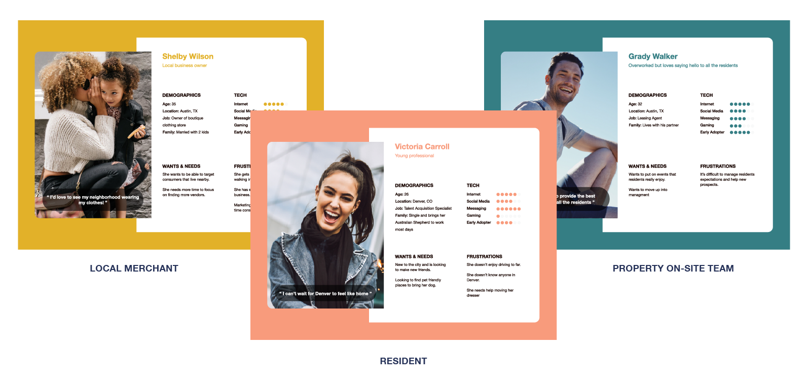
To make sure the product matched how people actually behaved, I segmented the audience and built personas grounded in real interviews and field observation, not assumptions.
Residents weren't antisocial, they just never had a natural reason to initiate. It wasn't a motivation problem. It was an opportunity problem.
Mapping The Journey
439.2 neighbors, barely known
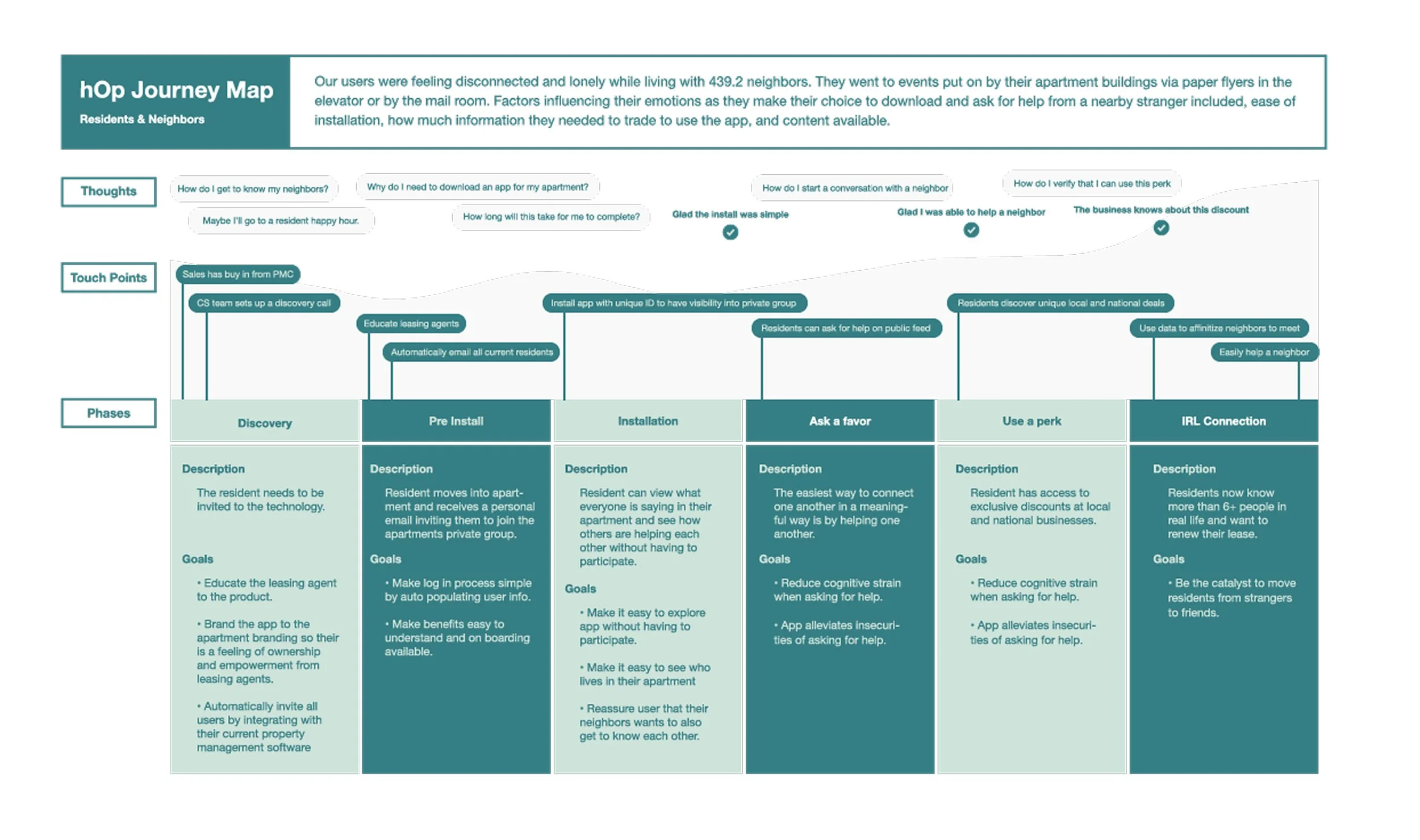
Our users were feeling disconnected and lonely while living alongside 439.2 neighbors on average. I mapped the full resident journey, from the moment hOp showed up in their building through what it looked like when community was actually happening.
The map runs Discovery, Pre Install, Installation, Ask a Favor, Use a Perk, and IRL Connection, the moment residents knew six or more people in real life, and had a real reason to renew.
The Favor
Asking a favor, made safe
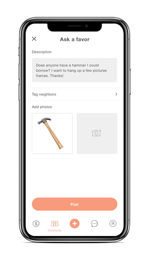
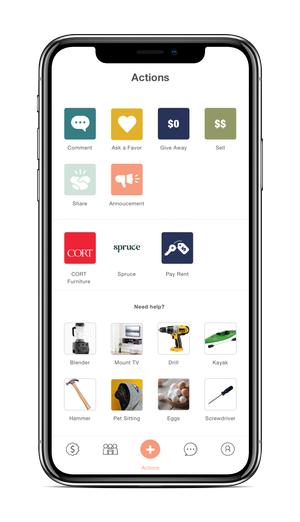
The founding hypothesis became a real feature called Ask a Favor. A resident posts what they need, a hammer, a hand moving a couch, help with flat-pack furniture, someone to walk their dog because they're sick, and neighbors respond.
The hard part wasn't the post itself, it was asking someone to invite a stranger into a moment of need. So we designed the ask, a shortcut, and an exit together, starting with a description field with the option to tag specific neighbors, adding a grid of commonly requested items so residents could tap once instead of typing from scratch, and finishing with a flag on every post so anything that felt off could be reported straight to the property team.
Beyond asking, residents could lend something out, give it away entirely, or sell it, the same surface covering the full range of how neighbors actually share.
The Feed
Where sharing, selling, and showing up live together
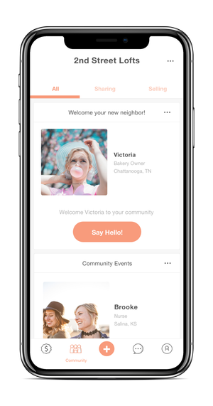
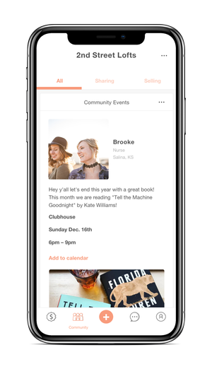
Everything happened in one community feed, organized under three tabs, All, Sharing, and Selling. Property managers used the same feed to post community events, with a one-tap "Add to calendar," giving them the RSVP headcount they needed without a separate tool.
This is also where the design had to earn its place. Residents weren't opening a fourth app for their building, they were opening the one that told them what was actually happening around them, this week, from people who lived thirty feet away.
That was deliberate. hOp's ambition went beyond community. The goal was for hOp to become the one tool a resident needed for everything tied to living in their building, not just meeting the neighbors. Paying rent, submitting a maintenance request, renting furniture for a new place, all of it lived inside the app through partnerships with other residential service providers, instead of asking residents to juggle a separate app for each one. I designed the surface that held all of it together.
Sparking The First Move
A Transaction isn’t a connection
Once the app was in residents' hands, a problem surfaced. Item sharing alone wasn't generating the community we'd promised. People borrowed the drill, said thanks, and went back to being strangers. The transaction was happening. The connection wasn't.
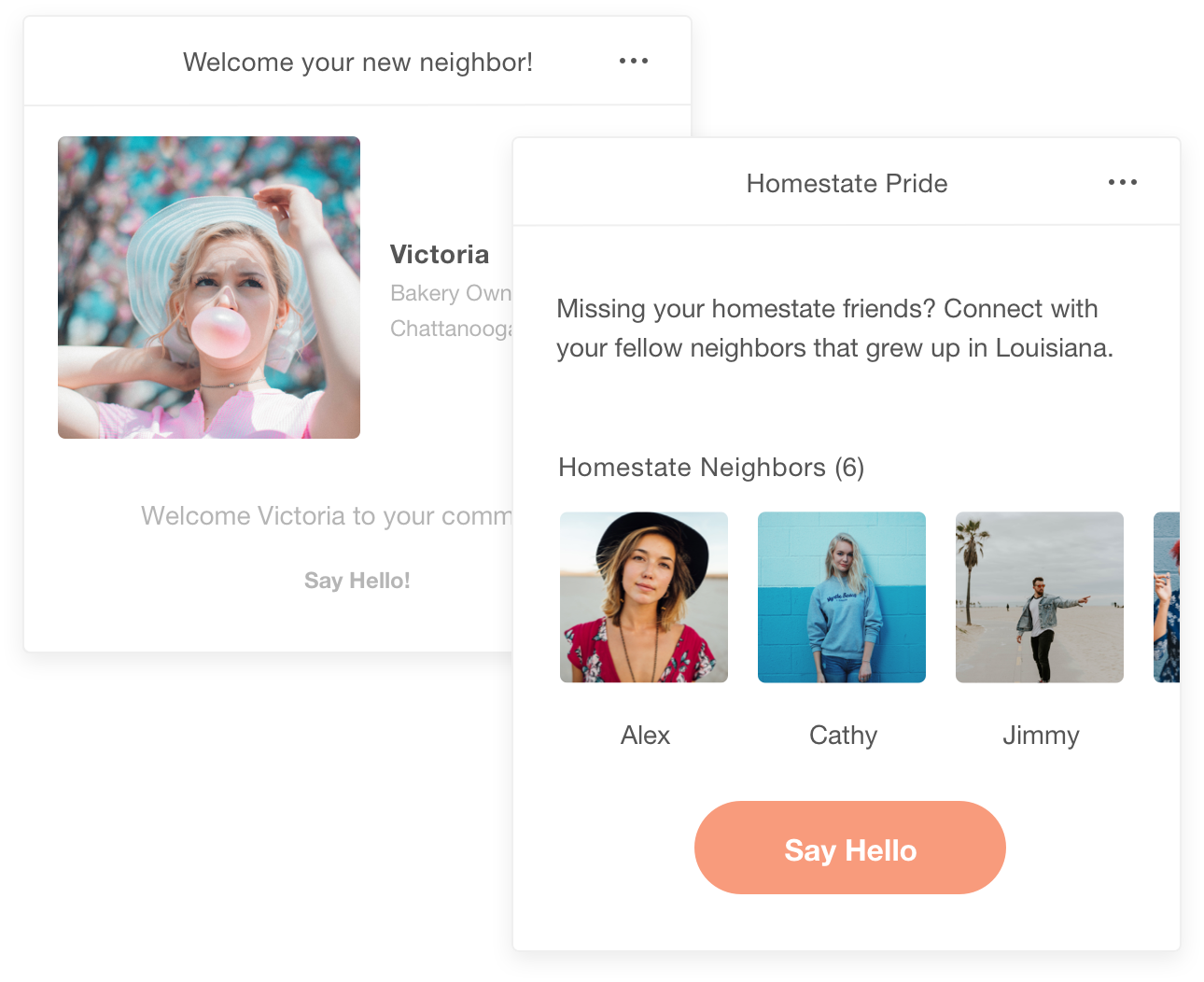
So we designed small, personal nudges to spark a conversation without the awkward cold hello.
Small things. But that was the point, the goal was never to build a social network, it was to give people enough of a reason to start talking that they'd take it from there themselves.
The Perk
The third side of the challenge
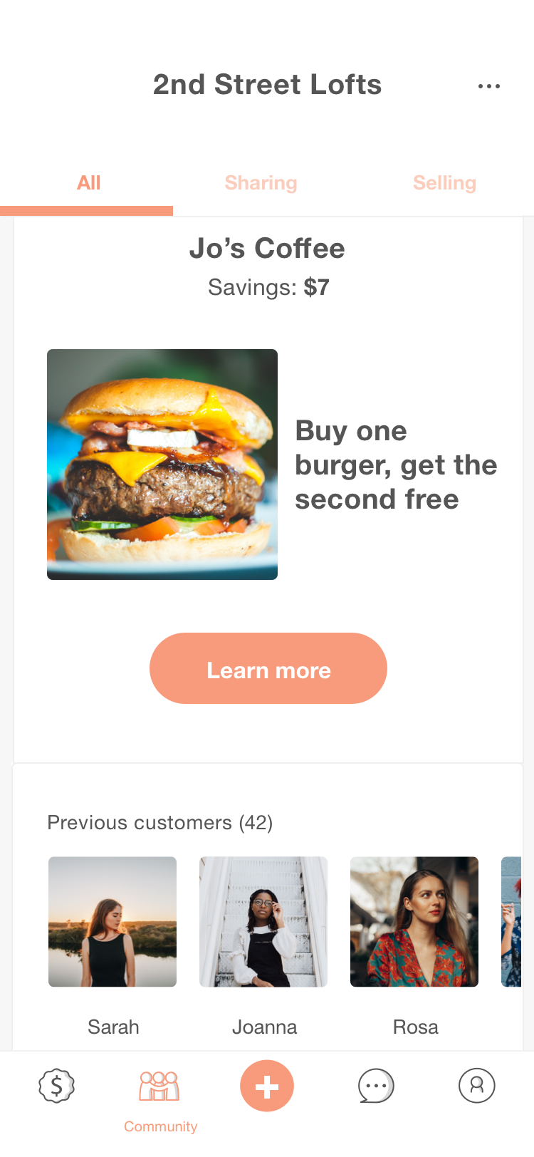
Local businesses were the third side of the ecosystem, and the feed is where residents felt that. A real, visible discount at a real nearby business, like Jo's Coffee, turned an errand into a reason to feel like a regular, and gave local merchants exactly what they wanted, nearby customers who kept coming back.
The Reflection
The nudges shipped quietly. The data never caught up.
Homestate Pride and the new-neighbor welcome both shipped to real residents. What I'd want to try next is a skill swap, so residents already knew who nearby could fix a bike or bake bread, tying straight back into the favor economy instead of sitting outside it. A shared-rhythm match, for residents who work from home and might want a coworking partner two doors down. And a same-event nudge, pulled straight from RSVPs, so residents who'd already stood in the same room at a book club had an easy reason to say hi again next time.
What we didn't get to was testing any of it rigorously enough to know which nudges actually built a connection, and using that data to keep generating better ones.